

AI Usage in Indonesia: What the Data Reveals About Adoption, Usage Patterns, and Integration Readiness
06 Jan, 2026
- 20,672 views

2016 - 2026 Copyright @ Graphie.
All Rights Reserved
Recent Projects and Selected Works
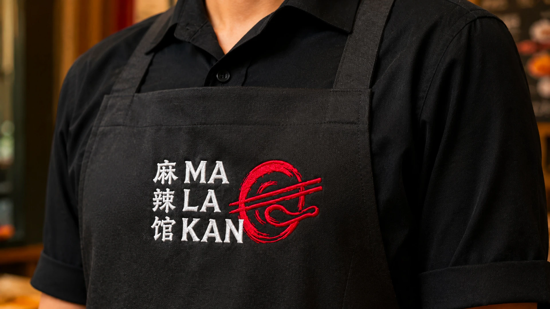
We designed the apron for Malakan by considering not only the brand’s visual identity but also the practical needs of the staff during daily operations. Black was chosen as the primary apron color because it helps conceal stains and food splashes, which is especially important when preparing mala dishes that use spicy ingredients and generous amounts of chili oil. Beyond its practical benefits, the black apron creates a modern, bold, and professional appearance while maintaining a clean and consistent visual identity for the Malakan brand.
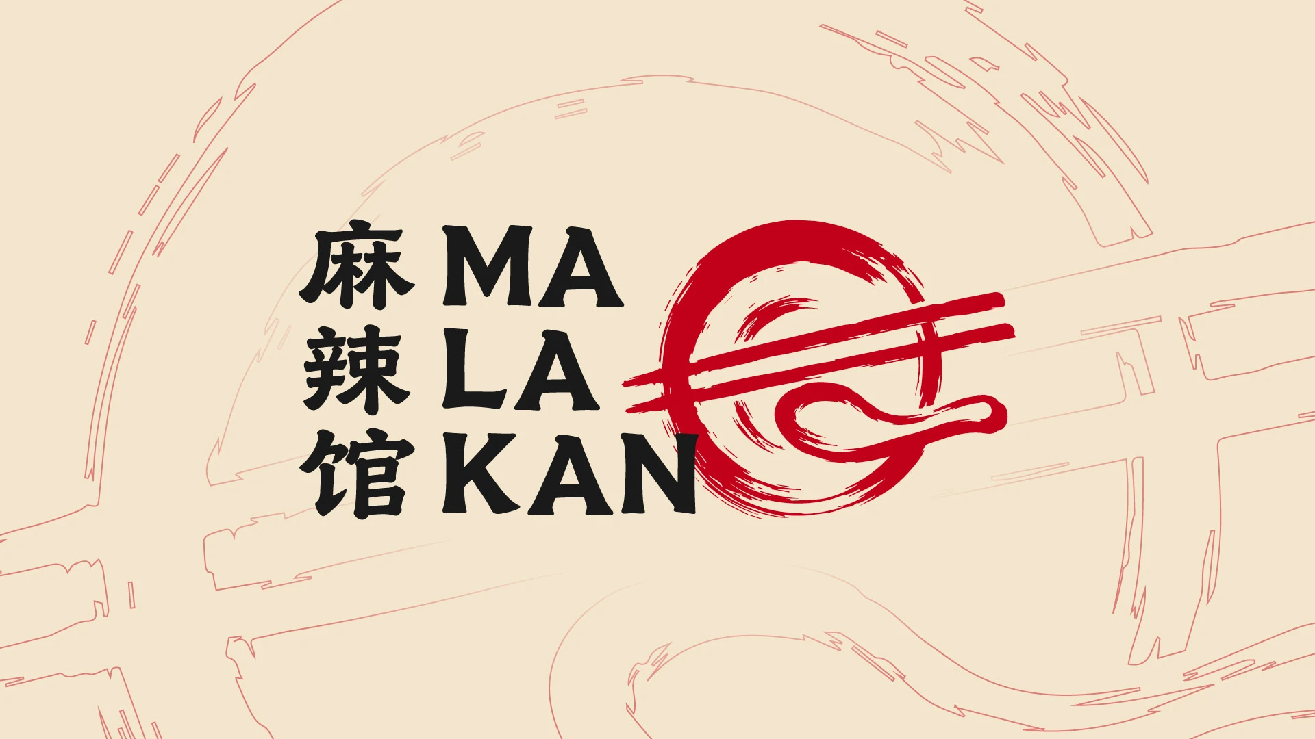
Graphie designed the Malakan logo with a modern, authentic, and memorable visual concept to strengthen the brand identity. The logo combines simple yet distinctive visual elements to create a professional appearance while reflecting the brand’s values and character. The harmonious typography and balanced visual composition result in a strong and easily recognizable identity for the target audience.
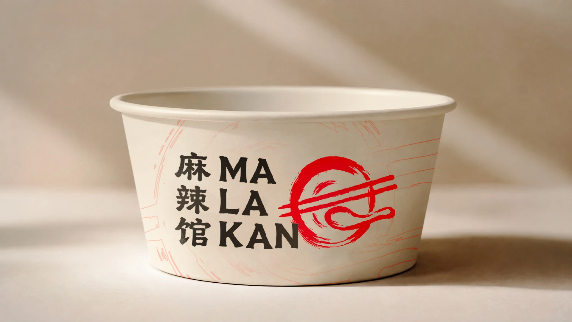
We designed the paper bowl packaging for Malakan by combining a clean, distinctive visual identity with practical packaging considerations, creating a design that feels modern while remaining closely connected to the brand’s character. The layout was carefully developed to ensure the Malakan logo and key visual elements remain prominent and recognizable from different angles, while the overall composition maintains a balanced and appealing appearance. We transformed the paper bowl into more than just food packaging—it became an extension of Malakan’s brand identity and a memorable visual touchpoint for customers.




Recommended for you
AI Usage in Indonesia: What the Data Reveals About Adoption, Usage Patterns, and Integration Readiness
The Best Power-Ups and Boosters in Ducky Pop: When and How to Use Them
The Hydrogen Fuel Frontier: Aryanto Misel's Nikuba Tech Shakes the World
The Psychology Behind Match-3 Games: Why Ducky Pop is So Addictive
Feeding the Future: Tackling Global Food Security with AI Agriculture
Ducky Pop: A Splash in the Match-3 Pool
From Idea to Launch: A Step-by-Step Guide to Building Your Dream Startup
The Digital Revolution: How Mobile Apps Have Transformed Our Daily Lives
Unlock the Hidden Worlds: Exploring the Different Themes and Levels in Ducky Pop
Tonework: The Future of Personalized Beauty is Here
Typography Tips That Wow: How to Use Fonts Like a Pro
Ducky Pop: A Splash in the Match-3 Pool
The Future of Website Design: AI-Driven Tools Transforming User Experience
The Power of Data Analytics: How to Drive Growth with Informed Decisions
From Zero to Branded Hero: How Print-on-Demand Empowers Small Businesses